Spark App
Checklists made simple.
In Walmart stores and Sam's Clubs across the country, store managers and bakery and deli associates perform daily food safety checklists using their Spark app.
While working at Walmart, I was responsible for troubleshooting Spark app issues. After hearing people's common difficulties with the app, I realized an app redesign could solve many of their problems and answer many of the most commonly asked questions.
The following prototype outlines an alternative experience for those performing food safety checks in Walmart stores across the country.

Motorola Handheld
Wireless handheld used by Walmart associates to complete their Spark app checklists.
Opportunities
User Feedback
The primary issue associates encountered was knowing when a completed checklist submitted. The completion of checklists was especially important for food safety reasons and because it was tied to employee evaluations.
More confusion was caused by misleading icons that were not relevant to their clickable action.
Business Needs
When a checklist was completed, the app did not give sufficient feedback indicating that the checklist was submitted. This could cause problems with data accuracy. Was the checklist not completed or the completed checklist not submitted?
Also, Food Safety managers could not easily add or edit checklists, or reorder a checklist's actions. Associates would usually complete only the top required actions related to food items. Therefore, items at the bottom of the checklists were often ignored. So, there was little to no data on these items.
Research Competition
Once I had an idea of the needs, I researched existing checklist apps with both good and bad user reviews. What were their common features, icons, and layouts?

TickTick
Appest Limited

Wunderlist
6 Wunderkinder

Stripes
Sahnghyun Cha

Checklist
Kijo Ito

Real Simple Check...
Time Inc.

Any.do
Any.DO

Checklist+
Dynamic App Designs

2Do
Beehive Innovations

Things 3
Cultured Code GmBh
Process
Brainstorm
After seeing what similar apps provided, I began the process of identifying which features, icons, and layout would be best for the Spark app.
I incorporated these ideas while sketching options for a simplified, easy to use checklist app keeping in mind the feedback from store and club associates and Food Safety managers.
Information Architecture
The following diagrams show the recommended order and flow of the app's screens and available actions.

Flowchart of screens and main options on those screens.

Example of a detailed hierarchy for a checklist that can expand or contract as needed.
Design
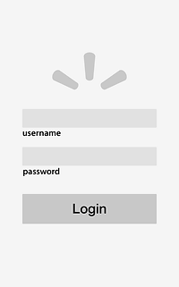
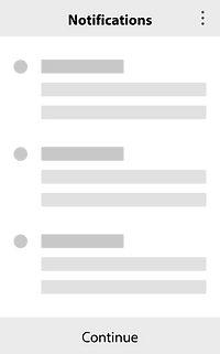
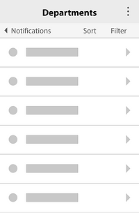
Wireframe
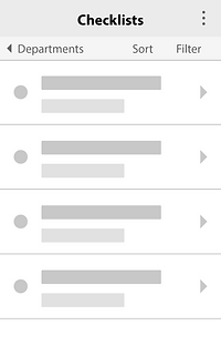
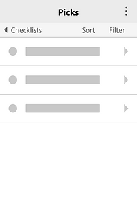
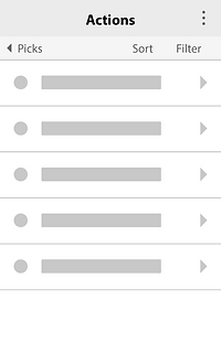
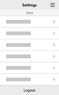
Design
Prototype
These are a few of the many screens that associates would use.
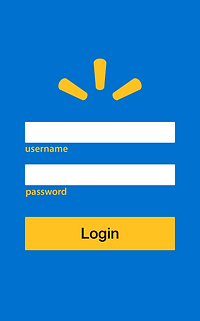
Walmart branded login screen.
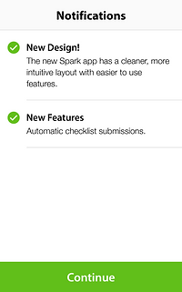
Automatically receive updates, warnings, and critical food recalls.
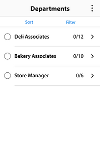
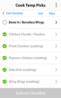
Non-checked circles indicate uncompleted tasks.
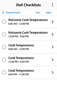
Time ranges show when each checklist should be submitted.
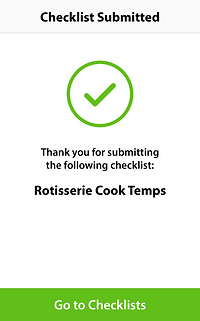
Receive confirmation when a checklist has successfully submitted.
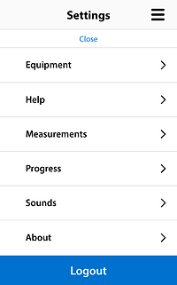
Simple to read Settings screen where users can quickly logout.
Unfinished tasks prevent users from accidentally submitting.
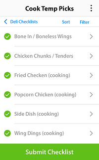
Easily submit the checklist after all of its tasks are finished.
Spark Design
Evaluation
Unlike other checklist apps, this design allows managers to organize and group actions into checklists and checklists into departments. The hierarchy can be deep or shallow depending on business needs; all while maintaining design consistency.
The design could also save time and energy when used by busy associates because it would easily step them through each checklist task.
Overall, I believe this redesign would help solve store and club associates' issues and Food Safety managers' needs.